The rapid evolution of consumer culture in the digital era has increased the strategic importance of packaging design in shaping product perceptions and purchase intentions. Packaging remains responsible for protection and information delivery, but it also functions as a high-impact visual interface that supports brand recognition and differentiation in crowded markets. Among packaging elements, color is often processed early and therefore strongly affects attention, perceived quality, and expectation formation [Guo et al. 2022, Martinez et al. 2021, Cullere et al. 2018]. In practice, color decisions influence both immediate affective appraisal and longer-term brand associations, making them a critical design variable rather than an afterthought.
This study focuses on how packaging color can support emotional response and the communication of regional identity, using Hunan Province (Hunan-Sheng) as the reference cultural context. Regional identity is treated here as a set of culturally shared visual cues—including color preferences and symbolic meanings—that can be translated into palette choices and color relationships on packaging. Although some color-emotion links appear robust across contexts, many meanings are culturally situated; therefore, regional symbolism must be handled as a design constraint rather than assumed to be universal [Lunardo et al. 2021, Huang et al. 2019, Yang et al. 2020].
The digital marketplace further complicates color selection. Consumers increasingly evaluate products through images delivered by mobile platforms and networked systems whose bandwidth, energy constraints, and security shape user experience and trust [Chandra et al. 2018, Saghezchi et al. 2013, Wang, Liu & Zhang, 2023]. At the same time, platforms apply compression, automatic enhancement, and other processing, which may shift hue or saturation relative to the physical package. This increases the risk that palettes carefully designed for print and material substrates are perceived differently on screens. Techniques from visual perception control and image enhancement illustrate both the possibility and the variability of such transformations [Li et al. 2025, Zhou et al. 2023]. In addition, cross-regional online commerce often requires multilingual and personalized presentation, which can influence how regional identity cues are interpreted across audiences [Liu et al. 2021].
Against this background, the paper has three aims. First, it consolidates core concepts in color representation, psychology, and contrast that are directly actionable for packaging design. Second, it discusses how these concepts can be used to build palette logic consistent with regional identity cues for Hunan. Third, it reports an exploratory consumer survey intended to provide descriptive evidence about (i) perceived determinants of individual color preference and (ii) common associations between “natural” products and colors. The survey is treated as a pilot validation that informs design recommendations and clarifies limitations that must be addressed in more controlled follow-up studies.
Color can be described using both chromatic (colored) and achromatic (non-colored) components. Achromatic colors—white, black, and intermediate grays—do not correspond to a single dominant wavelength, but they play a central role in perceived contrast, legibility, and affect in packaging. In applied design research, achromatic colors are therefore treated as integral members of the color system rather than as “absence of color.”
A practical description of color typically separates three perceptual attributes. Hue denotes the qualitative category (e.g., red, yellow, green) associated with dominant wavelength. Lightness (value) denotes perceived brightness on a black–white axis and depends on both illumination and surface reflectance. Chroma (often called saturation in informal contexts) denotes the strength or vividness of a hue relative to a neutral gray of the same lightness.
These attributes are formalized in several widely used color systems. The Munsell system describes colors using Hue, Value, and Chroma (H/V/C) and is commonly used when designers need to reason about harmony relationships in a perceptually organized space. Other systems include the PCCS system and the Ostwald system. In China, national standards have been proposed for naming, representing, and measuring object color (e.g., GB3182–82, GB3977–83, GB3979–83, GB5698–85, GB6749–86). In the present work, these concepts are used to keep terminology consistent when discussing packaging palettes and their perceptual effects.
Color psychology concerns how color features (hue, lightness, chroma) influence attention, emotion, and interpretation. Designers have long observed that a space dominated by certain hues can feel “open” or “cold” while others feel “warm” or “dense,” and such impressions affect communication outcomes. In packaging, these effects matter because consumers often make rapid judgments with limited information. Color can cue product category (e.g., “fresh,” “spicy,” “medical,” “luxury”), support brand personality, and bias expectations about taste, quality, or safety.
Importantly, color responses are not determined by physiology alone. Emotional associations are shaped by learning, context, and culture. The same hue may signal celebration, danger, or prohibition depending on setting and audience. Therefore, when packaging seeks to express regional identity, color choice must be evaluated not only for general affect (pleasantness/arousal) but also for culturally grounded meaning and perceived “fit” with the product and the region.
Perceived “warmth” and “coolness” are common cross-modal impressions of color. Warm hues (often red–orange–yellow) are typically associated with higher arousal and tend to appear visually advancing, whereas cool hues (often blue–green) are associated with calmness and tend to appear visually receding. These impressions interact with lightness and chroma: at the same hue, higher chroma often appears cleaner and lighter, while lower chroma can appear duller and visually heavier. Such appearance effects can be understood as perceptual “illusions” because perceived lightness and weight are influenced by surrounding colors and context rather than by physical pigment alone. Table 1 summarizes a conventional ordering of apparent lightness/heaviness used as a qualitative reference (1 = lightest, 7 = heaviest).
| White | Yellow | Green | Purple | Cyan | Red | Black |
|---|---|---|---|---|---|---|
| 1 | 2 | 3 | 3 | 5 | 5 | 7 |
Packaging design is a coordinated system in which brand identity, text, imagery, color, form, and material are organized to communicate product information and value efficiently. Beyond protection and logistics, packaging must support rapid recognition and differentiation at the point of choice—whether on a retail shelf or within an online list. Effective packaging therefore balances clarity (legibility and category cues) with distinctiveness (brand-specific visual signatures).
From a color-design perspective, palette selection should be deliberate and reproducible. To support systematic discussion, this paper uses the Munsell-inspired description of hue (\(H\)), lightness/value (\(V\)), and chroma (\(C\)) when analyzing harmony relationships. In practice, designers often begin from device-dependent representations (e.g., RGB) and then move to more perceptually organized spaces. In this study, representative colors were sampled from packaging visuals using Photoshop, and their \(L^{*},a^{*},b^{*}\) coordinates (CIELAB) were recorded under a consistent working color profile. The CIELAB values were then mapped to approximate \(H,V,C\) coordinates using an empirical conversion adopted for palette analysis, as given in (1)\(\mathrm{\sim}\)(3). The purpose of this mapping is not to claim a universal physical conversion, but to provide a consistent internal representation for comparing palettes and discussing harmony intervals.
\[ V=0.12L^{*} -1.60,\tag{1}\] \[ H=-0.06L^{*} +0.02663\gamma -14.30\theta -0.0913\gamma \theta +14.826,\tag{2}\]\[ C=0.1439\gamma +1.054\theta -1.022\theta ^{2} +0.0497\gamma \theta -0.167,\tag{3} \] where \(\,\theta =\operatorname{atan2}(a^{*},b^{*})\,\) and \(\,\gamma =\left((a^{*})^{2} +(b^{*})^{2} \right)^{1/2}\,\).
Munsell-based harmony approaches classify intervals in \(H\), \(V\), and \(C\) into regions that tend to be perceived as harmonious, contrasting, or ambiguous. In packaging, these interval concepts help designers reason about when a palette will read as calm and unified (small intervals) versus vivid and attention grabbing (larger intervals), while still maintaining legibility and brand coherence.
Packaging color exhibits several recurring characteristics in applied contexts. First, it is situational and seasonal: brands often introduce limited editions for seasons and holidays, and palettes are adjusted to match expected atmospheres and consumer mood. Second, it is symbolic and metaphorical: color can trigger learned associations (e.g., “fresh,” “spicy,” “premium”) shaped by experience, social norms, and local culture. Third, it must be consistent enough to build brand memory while flexible enough to perform across media. In the digital era, this includes robustness to screen-based viewing, compression, and platform-specific rendering that can shift perceived lightness or saturation.
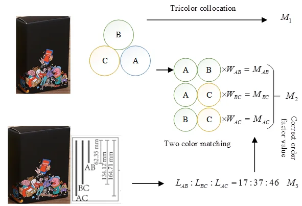
To formalize palette evaluation beyond qualitative description, the paper refers to Birkhoff’s concept of formal beauty, which models aesthetic value as an interpretable relationship between order (\(O\)) and complexity (\(C\)). When applied to color palettes, \(O\) can be interpreted as the degree to which hue, value, and chroma intervals follow a coherent harmony relationship, while \(C\) reflects the number and variability of elements in the palette. In this study, the order term is expressed through component contributions from hue polarity (\(O_{h}\)), lightness polarity (\(O_{v}\)), and chroma polarity (\(O_{c}\)). When a palette is effectively uniform (i.e., no meaningful color difference), the order factor can be simplified as \(O_{g}=1\) for descriptive purposes.
Using this logic, two representative palette states can be compared: an initial palette and a corrected palette after adjusting interval-related order factors (denoted here as \(M_{2}\) and \(M_{3}\) as schematic beauty values). Figure 1 summarizes the corresponding workflow for constructing and interpreting a quantitative beauty assessment for packaging color schemes (rather than for unrelated product categories).
Color contrast is the perceptual difference created when two or more colors are placed in proximity. In packaging, contrast is used to guide attention, support hierarchy (brand name vs. secondary text), and increase recognizability at small viewing sizes (a common condition in online shopping lists). Common forms include contrast in chroma (purity/saturation), contrast in lightness, and contrast in hue. Because perceived contrast depends on surrounding colors and viewing context, designers should anticipate appearance effects that can make a moderate chroma color look dull next to a highly saturated neighbor, or make a mid-lightness color appear darker next to a very light background.
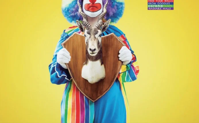
Figure 2 illustrates a straightforward example of lightness and hue contrast: a bright yellow background paired with blue elements. The combination supports rapid detection and legibility while remaining consistent with the product’s functional message (a “bright” paint product). In regional packaging, contrast can additionally be used to highlight culturally meaningful accents (e.g., a locally symbolic red) against a more neutral field, thereby balancing identity signaling with readability.
This case study is intended as an exploratory validation of the paper’s design claims rather than as a definitive test of Hunan-specific identity effects. Individual color preferences vary across consumers, and factors such as age, gender, and lived environment can moderate both affective response and category interpretation. To obtain an initial empirical indication of which factors consumers themselves perceive as influential, a sample of 150 consumers in Shanghai was surveyed using a multi-response questionnaire.
A sample of 150 Shanghai consumers was selected to investigate the perceived reasons for color preference. Respondents could choose more than one reason. The distribution of selections is reported in Table 2 and visualized in Figure 3.
| Reasons for Influence | Age | Gender | Geography | Herd mentality | Other reasons |
|---|---|---|---|---|---|
| Cumulative number of votes/vote | 92 | 79 | 63 | 35 | 23 |
| Percentage of votes/% | 61.3 | 52.7 | 42.0 | 23.3 | 15.3 |
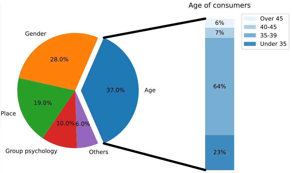
Table 2 and Figure 3 show that age, gender, and regional differences were most frequently selected as influential factors, followed by herd mentality and other reasons. Because this is a multi-response item, the percentages should be interpreted as selection frequencies rather than as mutually exclusive probabilities. Nonetheless, the pattern supports a practical implication: packaging palette choices are unlikely to be “one-size-fits-all,” and designers should consider demographic targeting and regional cultural context when defining brand color systems.
To further examine common associations between product meaning and color, respondents were asked to select colors they most often associate with “natural” product packaging. Again, multiple selections were allowed, and the results are summarized in Table 3 and Figure 4.
| Color Options | White | Green | Blue | Yellow | Red | Purple | Other colors |
|---|---|---|---|---|---|---|---|
| Cumulative number of votes/vote | 91 | 88 | 79 | 52 | 11 | 9 | 21 |
| Percentage/% | 60.7 | 58.7 | 52.7 | 34.7 | 7.3 | 6.0 | 14.0 |
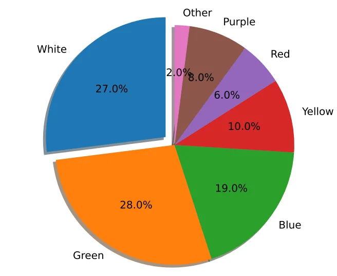
White, green, and blue were the most frequently selected colors for “natural” packaging. This suggests that consumers commonly map “naturalness” to cues of cleanliness (white), vegetation/health (green), and calmness/purity (blue). The observation that these colors are not often combined in a single package should not be treated as evidence that any specific combination will improve market performance; however, it motivates a design hypothesis: a controlled combination of these cues may allow a brand to signal naturalness while remaining visually distinctive in a competitive category.
The remainder of this section provides illustrative examples of how basic color meanings and palette structure can be used to support both functional communication and emotional response in packaging. Achromatic colors are frequently used to manage hierarchy and perceived quality. White often communicates simplicity, cleanliness, and openness, and it provides high contrast for typography and imagery (Figure 5).
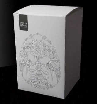
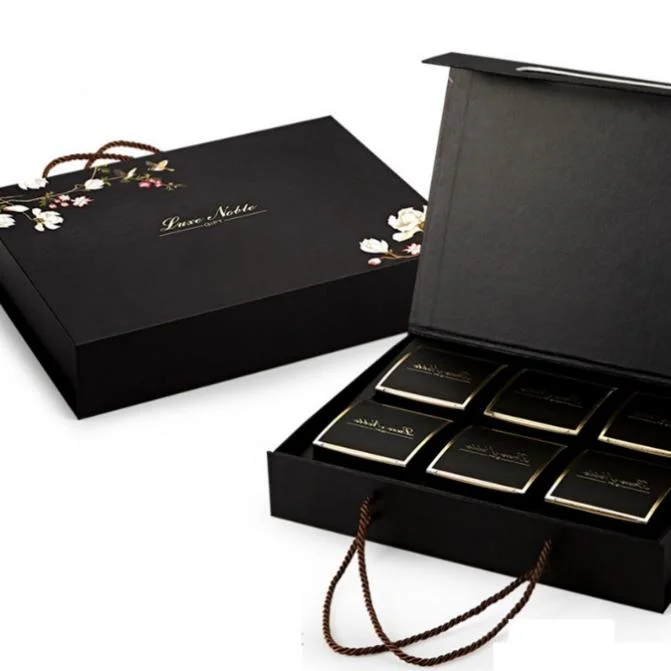
Black is often associated with stability, seriousness, and premium positioning, especially when combined with restrained typography and minimal graphics (Figure 6). In Chinese consumer contexts, red is additionally a culturally salient accent associated with celebration and vitality; in packaging it is often most effective as a controlled highlight rather than as an uncontrolled background that can reduce legibility.
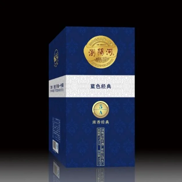
Blue commonly supports meanings of calmness, reliability, and technical competence; these cues are widely used in categories where trust and safety are salient (Figure 7).
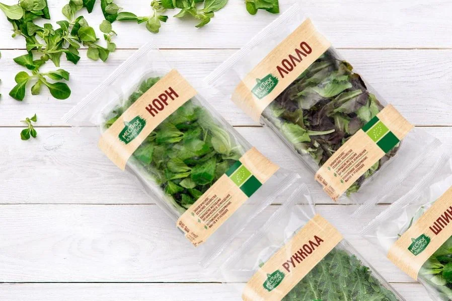
Green is widely associated with life, freshness, and environmental responsibility, and is frequently used to support “healthy” or “eco-friendly” interpretations (Figure 8).
Finally, the digital viewing environment can alter the perceived hue, lightness, and chroma of these palettes through device differences and image processing. Recent advances in image enhancement and guided information-flow models highlight the extent to which automated processing can change color appearance in displayed images [Zhou et al. 2023]. For packaging design in the digital age, palette decisions should therefore consider not only print/material constraints but also screen-based color appearance and the risk of unintended shifts in emotional tone.
In packaging, the visual effect of color has both functional and emotional roles. Functionally, color supports rapid categorization and information search (e.g., “is this a beverage, a personal-care product, or a premium gift?”) and improves legibility by establishing contrast between background, typography, and imagery. Emotionally, color contributes to the first affective appraisal of the product and can strengthen memorability through a distinctive palette “signature.”
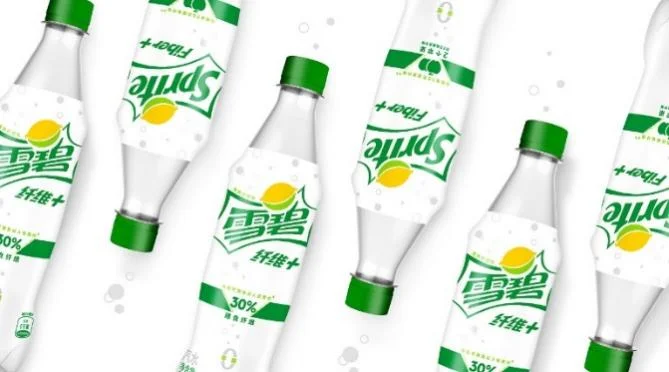
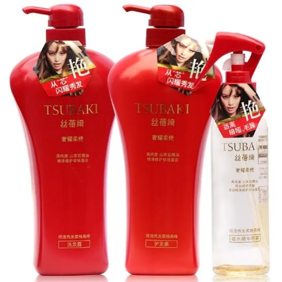
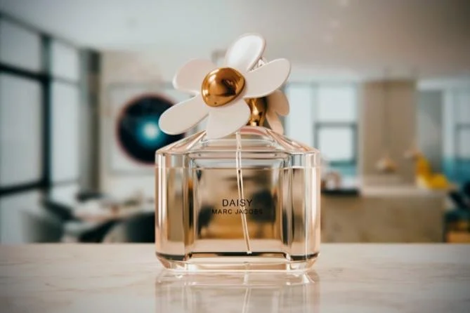
The image function of color refers to its ability to create a stable visual impression that helps consumers recognize a product quickly across repeated exposures. When a package uses a dominant, category-appropriate hue in a consistent way, it can become a retrieval cue in memory. Figure 9 provides an example of a high-chroma bottle design used to communicate freshness and energy in a soft-drink context, while Figures 10 and 11 illustrate how saturated accent colors and playful multi-color motifs can be used in personal-care packaging to express fragrance, youthfulness, or novelty.
Usability refers to how color helps consumers infer product attributes and intended use. For example, metallic gold and warm tones are often used to imply premium positioning or “tonic”/gift value, while restrained black–white schemes can signal luxury through minimalism when combined with careful typography and material choice. In practice, usability also depends on consistency with consumers’ learned category codes: a palette that violates strong expectations may attract attention, but it can also increase confusion unless supported by clear labeling. Therefore, functional color choices should be evaluated together with message hierarchy, contrast, and the constraints introduced by digital display (small thumbnails, compression, and variable illumination).
Color is a high-leverage component of packaging design because it shapes attention, emotion, and meaning under both physical and digital viewing conditions. This paper consolidated design-relevant principles of color representation, psychology, harmony, and contrast, and discussed how these principles can be applied to packaging palettes intended to communicate regional identity, with Hunan Province as the cultural reference. The use of perceptually interpretable descriptors (hue \(H\), value \(V\), chroma \(C\)) provides a common language for describing palette structure, while harmony and contrast concepts support the practical tasks of differentiation, hierarchy, and legibility.
The exploratory case study provided descriptive evidence that consumers perceive age, gender, and regional background as key moderators of color preference, and that white, green, and blue are strongly associated with “natural” product packaging in this sample. These findings do not establish causal effects on purchasing outcomes, but they motivate concrete design hypotheses: (i) palette strategies should be segmented for target demographics and contexts, and (ii) “naturalness” cues can be intentionally constructed through controlled combinations of cleanliness, vitality, and calmness without sacrificing brand distinctiveness.
Several limitations should be acknowledged. The survey is exploratory, relies on self-reported selections, and was conducted in Shanghai rather than within a Hunan-based sample; therefore, claims about Hunan-specific identity effects must be treated as provisional. In addition, screen-based color appearance and platform processing can alter perceived palettes, which motivates future work using controlled packaging stimuli, calibrated display conditions, and outcome measures such as perceived fit, trust, and purchase intention. Within these boundaries, the paper provides a clearer theoretical basis and a reproducible analytic vocabulary for designers and researchers interested in packaging color as an emotionally and culturally meaningful communication tool in the digital age.